There's a new visualization system in town which is touch-based (!) and for a mobile platform (!!) so i just had to review it. The name of the system: Metrico for the Playstation Vita.
Ok, by now it should be clear that Metrico isn't your usual visualization tool. It's a game which in its marketing very aggressively takes a stance about being heavily influenced by infographics.
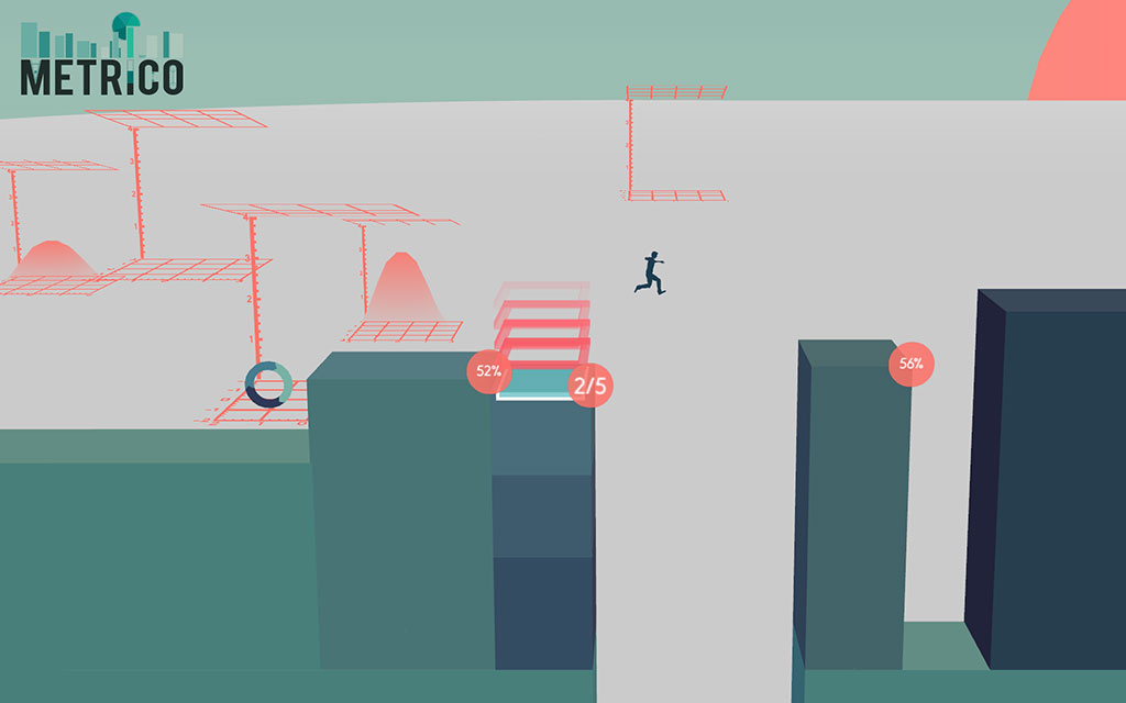
This essentially boils down to being a puzzle-platformer with a very minimalist style inspired by the aesthetic of infographics and charts. The overview map that connects the various stages is, how else could it be, a tube map, but doesn't grant any free movement and is strictly linear. The stages themselves are organized as sequential challenges where your goal usually is to counter gravity by running and jumping, while the environment consists of bar charts, pie charts, line charts, etc.

Metrico is a puzzle-platformer inspired by the aesthetics of infographics.
The initial loading animations were jerky and took some time which I decided to ignore in the name of science. Once everything has loaded, the game greets you with the selection of a male or female protagonist (maybe not so tough after all) and so begins the Infographicness.
The first stage introduced the core concept that my movement was tied to certain attributes of the environment (through callouts showing the coordinates for both the player and the objects): some bar charts would grow when I ran to the right, but shrink when I ran in the other direction. Other bars would slowly shrink every time I jumped, so I had to keep the jumping to a minimum to reach the top of the bar while still being able to use it as a point to reach a higher platform. While these puzzle aspects sound quite nice in theory, in Metrico it mostly becomes a pointless exercise in trial and error. The world doesn't have any type of internal consistency, so moving to the right, left, or jumping can lead to any result such as objects growing, shrinking, moving to the left or right, etc. At the end of the first stage the game had taught me that in order to succeed I had to frantically move in as many directions as possible while jumping pointlessly the whole time so things would happen. It became the most annoying when even the final results screen of a stage started forcing me to randomly jump about just to reach the next stage. Which is about as much fun as it sounds.

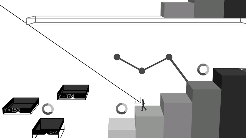
Some levels in Metrico adopt a neat monochrome appearance.
Internal consistency is what (good) avantgarde platformers get right and what's missing in the world of Metrico. Those games are all based on knowing about the player's awareness of the eternal mechanics of platforming: You have to move to the right. Avoid running into enemies, jump on them instead. Gravity is your enemy so combine running and jumping to reach higher platforms. Collect shiny stuff. Your princess is in another castle. Those concepts have become ingrained in our gaming subconscious by the flood of platformers triggered by Super Mario Bros. in 1985 and thus became a new material you could work with as a game designer. The remixing culture of indie platformers such as Limbo, Super Meat Boy and Braid built on this and made it part of the meta-game: those games are founded on the platformer mentality (clearly communicated to the player by the first encounter with interface and/or story), but twist it in interesting ways and maybe even subvert it (see Braid's ending). Similarly to Metrico, Braid is built on linear stages with every stage introducing a new mechanic that is then explored in the sequence of puzzles to follow. In Braid - in contrast to Metrico, however - the rest of the world behaves predictably, according to platforming logic. Once you have understood the main new mechanic of a stage, you can work with it, just as the level designer did in creating the stage. Both your mental models are aligned and there is no frustration from the environment's seemingly arbitrary behavior. Usually you can even crack a puzzle by thinking about it, instead of randomly trying things.

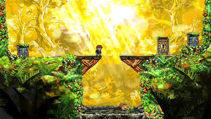
Not Metrico, but a related platform-puzzler: the ingenious Braid.
In Braid and those other platformers, objects don't just randomly react based on your movement which is just a terrible idea for a puzzle game. The recent Game About Squares is a great example for how to do puzzle games right: it introduces several core mechanics (move squares by clicking on them, get them to their homezone, they change directions when moving over an arrow, they can push one another) that aren't messed with throughout the game and combines them in challenging new ways in every stage. Basically Metrico's core mechanic for puzzles is "move randomly around and see what happens". This is about as entertaining as a puzzle game where your challenge is to guess a new key on your keyboard on every new stage. Now, this doesn't mean that it's the only mechanic that is used in the game: similar to Braid et al. there's a new mechanic introduced on every stage and experimented with. But since it all boils down to the random jumping/movements, every interesting mechanic is like a yummy new donut with the same weird mystery filling.
And even the idea of introducing new mechanics becomes tiresome pretty quickly due to their nature. The game designers decided to incorporate every single sensor of the Vita into their game, and there are many: touchscreens (two of them!), gyros, camera, etc. From stage 3 on, Metrico felt like one of those old Nintendo Wii-games that forced you to wiggle your controller from time to time just because it's possible.
So in stage 3, I can suddenly shoot, but only when I hit the touchscreen (with roughly 10 perfectly good (physical) buttons that are much easier to reach staying unused). A little later, I grow the ability to direct the shots by aiming with the backside of the Vita which doubles as a second touchpad. This, of course, regularly leads to erroneous shots just by holding the console and required much more coordination than I was able to muster at the first try of a new challenge. And once I had managed to pull off the (timed and aimed) shots without one shot too many - as there's this platform that grows with every shot so there must be exactly four of them not one more - I usually jumped or moved a bit by accident, thus sinking another platform triggered by the jumping/moving and having to restart the whole thing. After cursing for roughly fifteen minutes I had managed to solve all "puzzles" of stage 3. The next stage greeted me with a short tutorial on how to randomly twist and turn the whole console to make pie charts fill up. At this point I had enough (other reviews tell us that later you have to point the console's camera at real-world objects with a certain color, which is something I will unfortunately never experience).

I'm still not sure how I solved this part.
I guess I was expecting more from Metrico. The point of visualizations is communicating data in a more human-readable form. Yes, these visualizations sometimes look like something out of a video game, something that a little avatar could jump on, but that's not the point. That's like the nightmare that nine-year-old me once had after a ten-hour Tetris binge, where I was trapped in the game and had to jump from block to block not to get squished - it might look the same but it's something completely different.
What was missing from this game was the other side of visualizations: data. All Metrico charts were as arbitrary as the movements to solve their puzzles - they didn't mean anything. I had been hoping for some interaction with data to solve puzzles, a playful take on the visualization pipeline. There is space for such ideas, as Mini Metro, a game about constructing a subway network, shows: while it borrows the tube map aesthetic, its interaction and gameplay is basically about creating the underlying data, dragging and dropping subway lines to best solve the transportation problem. This data manipulation aspect is what I was hoping for with Metrico and which, I'm sure, could be a lot of fun when done right.
So from my enervating sixty minutes with Metrico I can conclude: it's basically Infographics: The Game. We probably all remember those horrible tie-in games that got released with each summer blockbuster in the 90ies and whose sole excuse for existing was that there was a known mascot or superhero in there (Wow, this heap of pixels kind of looks like the Terminator!). More often than not those games seemed like developers had used an existing buggy prototype that they had lying around, just slapped on some new assets that the gods of trademark had granted and presto.
Metrico is the same. It's a not very entertaining game, in parts clunky and plain weird and has a hint of unfinishedness to it. The amount of entertainment I got from it was minimal (I mostly kept to it to write this review, so I can now understand the pain of being a games journalist). But even though it's just plain no fun and the gameplay sucks, hey, there's a bar chart! You know bar charts! And there's a pie chart, they're your favorite supervillains! And some node-link-diagrams floating in the background! But all those charts only live in the asset-folder and are completely interchangeable without any impact on the gameplay. Without the infographic gimmick this game is just an obscure, frustrating and completely forgettable platformer.
Verdict: Two out of five pie charts.

