▶ Check out OECD Regional Well-Being
Well-being is a tough data set to capture: not only is it influenced by multiple factors (health, income, safety, etc.) but it also exists on various levels of granularity. You can spend a lot of time and effort measuring it for a single person, but what's more interesting is how well your city, region or even country does in this regard.
The OECD is tackling this question with their Better Life Initiative. One part of it, the long-running Better Life Index (BLI), is addressing this question on the country level and recently got it's all-new 2014 update:
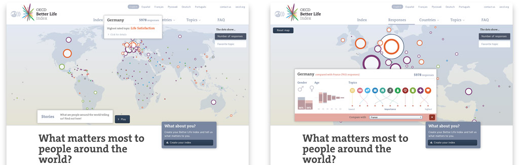
The OECD Better Life Index 2014 edition shows well-being - and in its latest version people's priorities - on a country level.
This year, the BLI also finally got its first sibling: Regional Well-Being. In this project, my amazing collaborator Moritz Stefaner and myself approached the challenge of visualizing well-being data for 362 regions worldwide. While country-level well-being gives a good idea of how well a country does in this regard it's not the whole picture: regional well-being highlights all the sometimes subtle, sometimes blatant differences between parts of these countries.
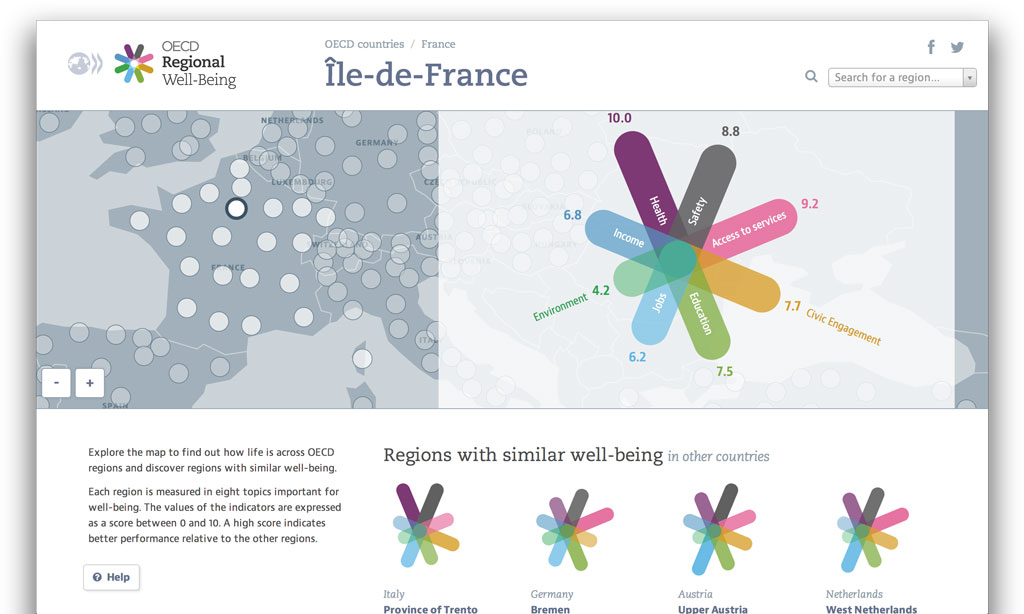
OECD Regional Well-Being shows well-being across 362 regions worldwide.
Regions and Well-Being
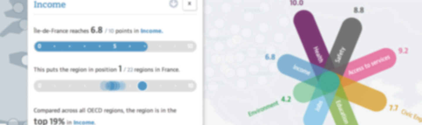
Regional Well-Being (RWB) represents each region in the data set as a star, mapping each of its 8 well-being dimensions (access to services, civic engagement, education, etc.) to one of its arms: the longer the arm, the better the region fares in this regard (additionally, we have a textual scale going from 0 to 10). The nice thing about this chart is that it works even without labels to provide a sense of a region's quality of life. So, we're re-using it to show related regions to the currently active one. Plus, it's similar in function and look to the BLI's flowers (except for the gradients but, you know, flat design and all).
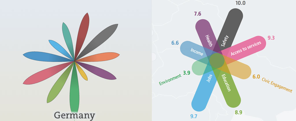
Stays in the family: the Better Life Index uses flower charts to represent countries, while Regional Well-Being depicts regions using the related star charts.
To dive deeper into the data for one region, just scroll down: below the map and the star charts are eight cards showing more detailed comparisons between the regions in one country along one dimension. These cards can be flipped to show comparisons on a country-level, too. Once you found an interesting aspect, you can also briefly hover over it to get a widget for posting it on your social network of choice.
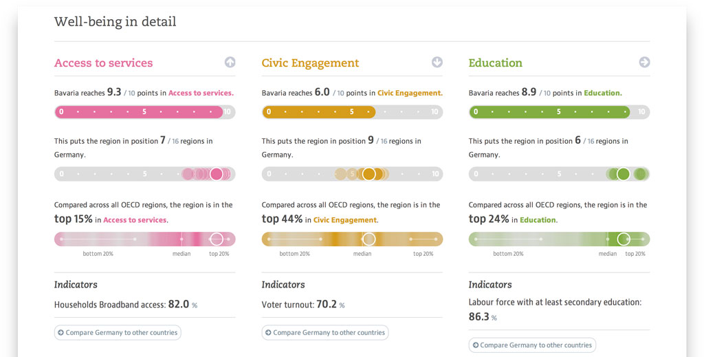
More detailed information about one dimension and comparisons come as cards.
While these representations create a solid understanding for one region's data, what about the other 361? How to allow comparisons and navigation?
Region hopping
When we set out to work with the data, the natural impulse was to show global comparisons. And these first approaches regularly lead to lots and lots of dots:
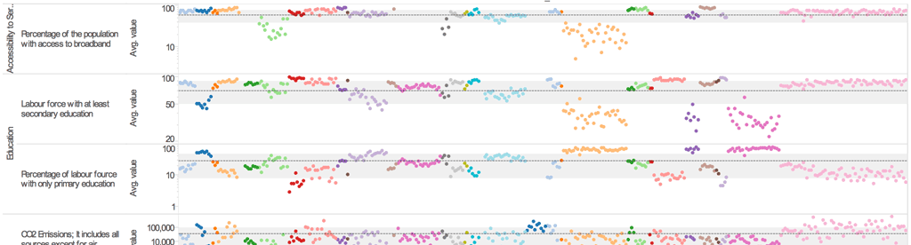
Strong correlations between global comparisons of complex, regional well-being data and lots of dots.
High complexity without any real use - we knew that most regions wouldn't mean much to our visitors (quick: where are Swietokrzyskie, Oaxaca and Nunavut?) and having a visualization drown in this info would only make it much harder to decipher. So we decided to start with the region that people visiting the site should know best: the one where they currently live.
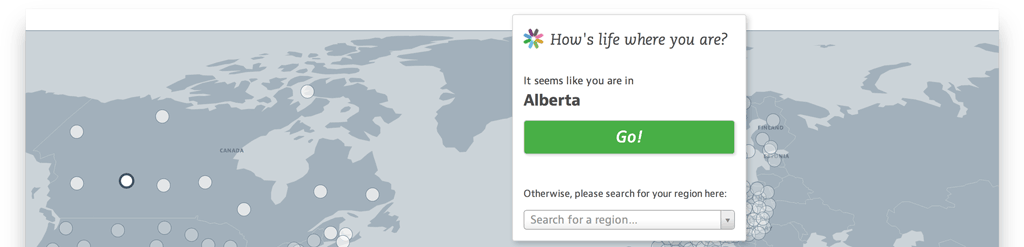
Regional Well-Being detects where you visit from and uses this region as a starting point.
We use the new HTML5 Geolocation API to detect your location and use your region as the starting point for the exploration. This privacy-conscious approach lets you decide whether they want to share your location, in contrast to server-sided, forced opt-in versions.
Once the current region has been detected, you can set out to explore: comparing your own perception of your home region to the OECD's 0-to-10 values equips you with a better understanding of those scales.
From there, you can move one step up and compare your own region to other regions in your own country. Also, you can learn about the - often surprising - similar regions across the globe. Finally, it's also possible to directly search for a region or click on it on the map.
Have fun exploring Regional Well-Being!
Here's a detailed explanation of our experiences with using the HTML5 Geolocation API in the project.
There is one more technical blog post about RWB coming up discussing how we made the visualization responsive, so stay tuned.
More about OECD Regional Well-Being:
Moritz about OECD RWB