Every popular artist has their own unique style. If they're really good at it, they can be recognized after only a few moments of exposure. When you look for example at filmmakers, think about how many directors you can name without looking them up on IMDB. Those are the people that create movies in a certain unmistakeable style. The directors who gather a crowd of fans who wait for their every movie.
When you think about it, they come in basically two flavors: they're either painters or storytellers.
Directors as painters are the ones who have a keen eye for visual details. They focus on camera work, image composition and special effects. One of the most prominent of recent examples is probably Wes Anderson. His almost geometric arrangements of scenes and the artificiality of his set pieces leaves his characters as strange intruders in paintings that have come to life. Before him, Tim Burton was using film to show the beauty in creepiness and blurring the lines between the monsters in our neighborhood and the monsters in all of us. And, of course, there's Michael Bay, whose quite distinctive, if not necessarily artistic style and his love for explosions has become so iconic that "If Michael Bay directed" has even become a meme.
Visualization designers' unique styles can be based on visuals, narrative or interaction.
On the other hand, there are directors whose focus is on showing characters' growth throughout a narrative, telling a story in a compelling way and playing with the medium of film itself. The early films of Quentin Tarantino like Reservoir Dogs or Pulp Fiction explore the linear structure of film as a fascinating and quite unreliable narrator (he later shifted his focus more towards the visual side of things). Similarly, Christopher Nolan's Memento or The Prestige open up new venues for non-linear character development and stories that gradually reveal themselves. Finally, more linearly oriented directors like Darren Aronofsky manage to make us life through a character's development by relying on the language of film.
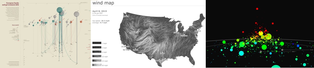
Painters of vis: Accurat's "European Banks and Government Debt", Wattenberg and Viégas "Windmap", Thorp's "Kepler"
Of course to become this iconic these directors had to be gifted in both regards and they're all experts in either side. But their recognizability usually comes from either pictures or story.
Interestingly, it's the same when it comes to data visualization: really recognizable work also tends to fall into one of the two camps. Its designers might be gifted visual artists or gifted storytellers. But since visualization (and video games and other interactive media in this regard) are quite a novel form, there's another, a third focus: interactivity.
Interactive visualizations let us learn about systems of items and attributes. They teach the patterns within the data.
Interactivity is an interesting beast, since it shifts responsibility for the outcome of the experience towards the audience. A film always tells the same story, in the same pictures, every time it plays. But an interactive becomes something new with every reader who encounters it. People might even produce entirely novel outcomes that the original designer hadn't anticipated.
Interactive visualizations let us learn about systems of items and attributes. They teach the patterns within the data. Let's call designers who focus on interactivity teachers, since they enable discovery and set sensible limits for exploration.
The painters of vis, with their focus on visual style, are people whose work can be recognized at a glance: Giorgia Lupi comes to mind, with her visualizations that often feel like abstract paintings ripe with information. Martin Wattenberg's and Fernanda Viégas' Hint.fm projects explore flow as unique visual form. Jer Thorp's works highlight how 3D expansions can work for vis without distorting information (too much).
Storytelling and narrative are the main venues for data journalism: among others, the New York Times data team manages to pump out amazing visualizations every day in their clean and straightforward style. On a smaller level, Nick Felton's yearly reports infuse graphics with 365 days of stories. And while Jonathan Harris is currently on visualization hiatus, his and Sep Kamvar's We Feel Fine is still my favorite example for telling stories through vis.
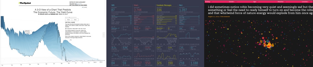
Storytellers of vis: NYT "Yield Curve", Felton's "Feltron Report", Kamvar's and Harris' "We Feel Fine"
That leaves us with interaction. Who are the people who have coined a distinctive style with interactions in visualizations?
Since we're working in such a young medium, examples for that are harder to come by. Additionally, beyond the pioneers who have come up with novel interaction techniques - mostly back in the 90ies and in an academic context - experimentation is far and few between. Usually, one relies on hovering for details, some zooming and panning and a couple of buttons or sliders for the rest. People know these things and it's risky to introduce novel paradigms.
When I had to name people or projects that push interaction forward and have maybe even coined their own unique style in this regard, I'd say: Santiago Ortiz with his love for fisheye lenses and pseudo-3D navigation; the various (mostly academic) projects running on Tabletop displays and exploring more natural interaction (maeve, Sultanum et al.: Touching the Depths, Spindler et al.: Tangible Views); and finally works on the big frontier of touch-based visualizations (Kinetica, Sadana's and Stasko's Touch-based Scatterplots).
But we're still at the beginning when it comes to interaction! I'm convinced that novel platforms such as touch will introduce many more fascinating and unique styles in interaction. And projects in virtual reality are slowly appearing but still uncertain when it comes to interaction. It's a great time for the teachers in visualization to come forward.