What we think about as static — visualizations or any other medium — does not, and even: cannot exist. Reading and understanding turns everything interactive.
Let’s take a simple example to make my point, one “static” visualization that is almost cliché: Napoleon’s march by Minard.
This graphic has been thrown around so many times since Tufte brought it up in his landmark book that you’d be hard-pressed to find a visualization course that doesn’t mention it.
Let’s look at it — once more:
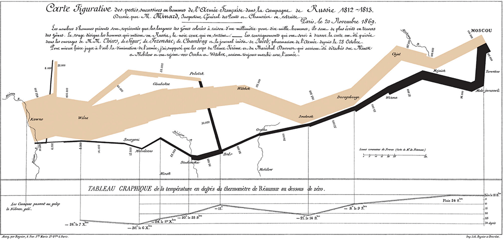
Charles Joseph Minard: Carte figurative des pertes successives en hommes de l’Armée Française dans la campagne de Russie 1812–1813
If you’re like me and you spent far too much time on this stuff, you’ll probably just brush over it. It triggers the “Napoleons march by Minard” association in your head and your good ol’ lazy brain thinks: ok, been there, done that.
Try to read it, though (do it for me — I’ll wait here in my parentheses).
If you actually read Minard’s visualization, you take in one concept after the other. You might start with the headline and give up after too much French. Then you take on the main, brownish stream. Glance at the depressing black backwards stream. Then brush over some numbers and maybe the scale at the bottom.
Having understood what’s there and how it’s organized, you actually start to take in the data. You read from left to right, because that’s how you learned to do it, absorb Polish city names, look at the smaller and smaller army arrow and the weird turns they make. Once at Moscow, you take the trip back, follow the black area-turning-line. After that, you realize why Minard put a clever temperature scale at the bottom, providing another helpful explanation to make sense the disaster.
While reading the visualization the data unfolds.
And this is no accident, this is just the only way we can ever make sense of a visualization.
If we tried to visualize your reading the visualization (so meta) it might look like this:
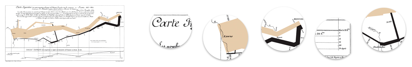
Reading Minard
If you read a visualization it’s no longer static. It can’t be. Just like words, reading always happens in time.
We can’t have it any other way. We as humans are temporal beings, one moment after the other until the last.
While going through time, our mind changes, our ideas and concepts of the world. We learn new things constantly, if we want it or not.
Think about every visualization you’ve ever seen (I won’t wait this time). You might have the habit of splitting them into “static” and “interactive” (the ones with buttons), because that’s how you learned to do it. We people are just amazingly fond of drawing borders.
But in this case, it does not make any sense.
Here’s a shitty infographic:
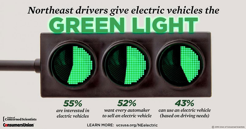
So little data! So big bubbles! So little interaction!
But interaction is all there is. Think through how you would read it. Again, starting with the headline, looking at visually prominent parts, reading the big big numbers, understanding the concept and finally absorbing the data.
No matter what you’re taught — even the thinnest infographic is inherently interactive. It can’t be any other way.
Reading any visualization is a two-step process:
1 Understanding the encoding
2 Reading the data
The first part, grasping the encoding, the visual mapping or whatever you want to call it, teaches you the meaning of all those circles, rectangles and lines. You find the connection between some topic (soldiers of the French army) and geometric shapes (width of arrows).
And usually, there’s more than one type of data to absorb. In Minard’s case, we also see the temperature, we see city names and even dates (usually, if a graphic only contains a single type of data we tend to sort it into the shitty-infographic-category — just too little data to bother).
If we have something like visualization literacy, we also come pre-equipped with a set of charts we readily recognize and understand. Making sense of something like a map or a timeline seems obvious to us, but it wasn’t always. Every type of chart has been invented at some point and we just learned it. Now, visualization designers can build on that knowledge, making this first step far easier, and come up with ever-cleverer combinations of charts.
In Minard’s example, we have a shrinking area moving along a map and a timeline at the bottom. In the shitty infographic, we have circle area/angles.
You could call this the “onboarding” part. Teaching people what they have in front of them and how to use it. If it’s done well, this step is painless.
If it’s done poorly, people will get lost in geometry soup.
Once we understand what the shapes mean we can start reading the data. And while the first part — if well-done — is relatively straightforward, this second part of actually understanding what’s happening is everything but.
Depending on your preferences, your knowledge of the data and subject matter, you can start reading wherever you like. Clearly structured visualizations like Minard’s give you a good idea here — the visual shapes point you towards the right way (sorry). Visual hierarchy establishes a reading hierarchy.
But other examples aren’t as obvious:
Especially in scatterplots, every entry point makes sense. Start with the overall blob of points in the middle – the “normal” – or look at the outliers. Follow one axis or the other. Search for specific points of interest to you.
Once a visualization no longer tells a linear story, it’s choose-your-own-adventure. Any story you can find is fine — it’s your very own.
Except for the main two-step-process of understanding and reading, every other order is made by none other than the reader.
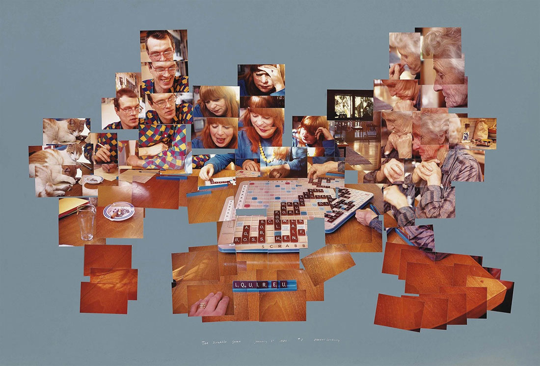
Here’s a great example by artist David Hockney (via Nicholas Felton’s excellent Photoviz and Frank Chimero’s ‘The Web’s Grain’ essay):
Hockney encodes the temporal aspect of the Scrabble game through spatial geometry. Looking at the piece, readers decode the game’s time by looking at this part, then that, then the other one. Playing it back in their own
heads, using their own eyes.
Arguably a visualization, The Scrabble Game again follows the two-step process, even without any explicit instructions.
We see familiar shapes of faces and a scrabble board, notice the inconsistencies and understand that time is encoded as overlapping photos. We then start reading it, jumping from picture to picture, taking in the data and forming the story.
Only a visualization no one ever sees can be static.
Visualization designers sometimes forget that visualization is a collaboration between them and the readers. And a visualization without an audience is a useless artifact. Making the encoding unnecessarily impenetrable or unlearnable or picking extra-shallow data just to create something aesthetic.
Someone invested time and energy into building the thing just to lock it up in a cupboard.
Even our “interactive” visualizations are nothing but static visualizations in time. If well-done, the encoding is consistent and it doesn’t matter if you filter for this-or-that first. It also doesn’t matter if you highlight this item or the other one. Nothing jumps around the screen and the encoding doesn’t morph halfway into something else.
You can restrict a reader’s journey through the data by pressing the “interactive” parts into a video, forcing them to sit through 2.5 minutes of you exploring the data for them, but again: all this happens in time, it has to, and even in a given frame, every one looks at something else (see the famous Selective Attention experiments in psychology).
And this is the same for any medium. Books and other textual mediums give us a relatively clear structure, which we still constantly ignore by going back and forth. While websites exist as infinite rectangles, people scroll up and down, focus on this and that. What we think of as a static website is really an endless series of short glimpses, bits of text and image parts, strained through our mind’s sieve.
Since visualizations are nothing but a practical form of pressing data through our eyeballs, we can’t escape their restrictions. Small eye movements (saccades) happen every 20 ms at rapid speeds. Every time we take in a small part of the world. Our brain manages to present us the illusion of a stable environment instead of a crazy roller coaster of dashing shapes.
One level up, the same happens when reading. We take in information, we understand and then ponder it. Our minds trick us into believing we had absorbed a whole text, while in actuality we’ve only kept the main points — everything in bold and whatever seemed fishy to us — and that we finished it and can take it off our bucket list.
Reading a text or visualization is exactly the same. Which is why visualizations can never be static, no matter what your textbook says.
We temporal beings are trapped in moments. We gather new information constantly, learn new things, but have them interact with what we already know and our more immediate memories. This beautiful dance of thoughts can only work in time.
And just as you can’t understand a visualization by looking at it (ooh pretty!), you can’t make sense of them without taking them in in your own time.