Wahl 2Q17
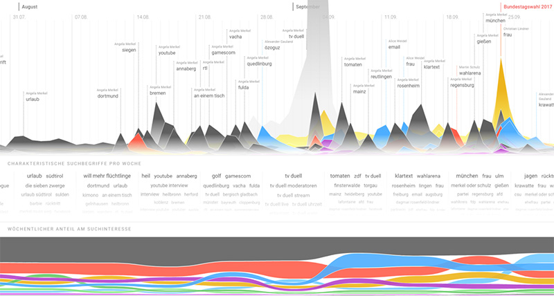
In time for the German Federal Election, 2Q17 showed what Germany was looking for when typing a candidate's name into Google.
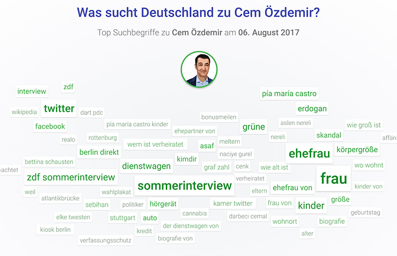
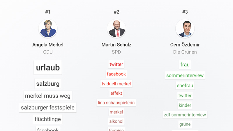
One of the declared goals of the project was to bring the often reviled word clouds back. Right at start, daily search terms for each candidate appear as beautifully flowing word clouds, making the hot topics of a given day immediately accessible. This daily data refresh highlights how search interest changes and how new events and developments come into view. Little scandals and hickups join the perennial favorites of gossip and looks.
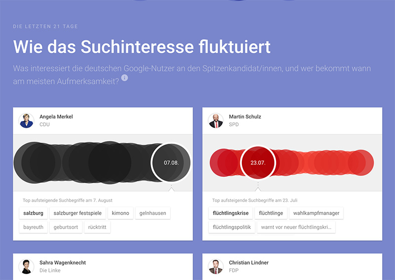
Scrolling down the page, we zoom out time-wise and look at the last 21 days in a series of bubble charts. This provides a more immediate comparison of candidates when it comes to search interest (with chancellor Merkel usually coming out on top).
At the end of the page we have a long timeline of all search terms over the year. In a nod to joy plots, they form a mountain range of topics and candidates. Naturally, the election day itself was big for all candidates, but there's a story hidden behind every combination of search terms and candidate names and every peak.
2Q17 branches out a bit from its original form as a live website: the integrated embedding tool enables journalists (and everyone else) to integrate the candidate word clouds into their own sites. And a collaboration with Spiegel Online led to an in-depth article on search behavior centered around an interactive embed of our timeline.