The death of one man: that is a catastrophe. One hundred thousand deaths: that is a statistic!
- Kurt Tucholsky, Französischer Witz (1925)
After writing about the potential death of interactive visualizations, I want to touch on why they’re still absolutely worth it.
We as humans are notoriously bad at forming a balanced and comprehensive picture of anything more complex than our shoe strings. We’re plagued by various cognitive biases that span everything from an extreme interest in things that confirm our existing ideas and beliefs to preferring lots of completely useless data to less, more focused information. One of the most notorious ones is our tendency to overvalue singular examples: anecdotes are our favorite way of making sense of a situation - or more often to shoot down unpleasant truths (I’m sure you also know someone whose grandpa was a heavy smoker and made it to the age of 93).
Fortunately (and despite all these biases), we also invented a method called statistics, which promises to sieve data and only leave pure information behind. After applying various types of statistical analyses (or more newfangled machine learning methods) we usually arrive at a set of numbers that clearly and unambiguously describe our data’s distribution and whether our hypotheses were right or wrong.
NERDS: Statistics is pretty cool guys ok
— Nathan LeClaire (@dotpem) March 21, 2017
WORLD: whatever
NERDS: :(
NERDS: it's called Machine Learning now
WORLD: OMG MUST HAVE IMMEDIATELY
However, statistics sometimes seems to be too much for our feeble human minds that deep down long for stories, emotions and things they can potentially grab and smear with mud.
So how do we bridge this gap? How can we relate to parts of our data while at the same time being able to see the bigger picture?
The answer is micro-macro.
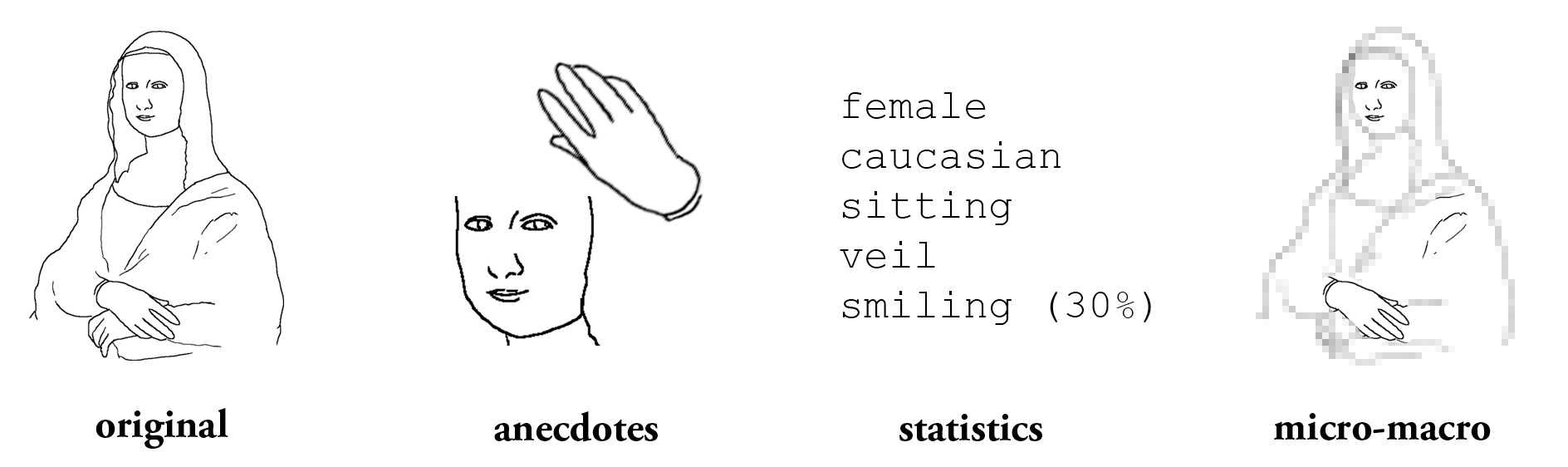
Ways to describe the world: cherry-picking anecdotes, abstract descriptions from statistics and getting an overarching picture with micro-macro.
What I mean by micro-macro is trying to get a better understanding of the world by accessing it on two levels: for one, there’s the micro-level of anecdotes where we get the good feeling of looking at actual, concrete aspects of the world instead of abstract mathematical descriptions. But we combine this with the macro-level to understand how these relatable anecdotes fit into the whole.
This dual approach enables us to estimate if a given example represents normalcy (a stand-in for how things “usually” are) or is an outlier and does not allow conclusions for all cases.
Plus, we’re also avoiding a problem with statistics: by reducing complex data to simple numbers, we’re of course losing information. All outliers and other weird aspects of the data simply get smoothed out until we end up with a clear bell (or other) curve. The smoking grandpa would just never show up in a simple histogram.
Fortunately, there’s data visualization which is the premiere tool for enabling us to browse data sets in a micro-macro way.
micro-macro + datavis = ❤
Take as an example for this thoroughness of data visualization Periscopic’s U.S. Gun Deaths in 2013 visualization:
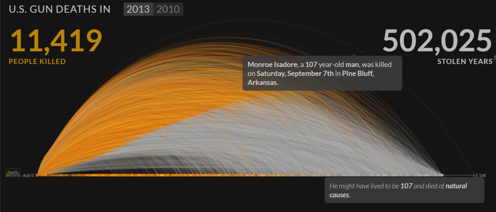
This disturbing piece shows how many people have been shot in the US in 2013 and the resulting number of years “stolen” (based on US Census data). Every victim becomes one arc in the visualization, with their years alive colored orange and the rest in a somber grey. By showing every person as a visual element, the visualization does not only provide a more striking image of the extent of these tragedies but also avoids reducing these people to aggregated statistical numbers (average age when shot or something). Every haunting story is still in the data and the graphic.
But these anecdotes (micro) come in the context of the visualization (macro): it’s clear that a given arc is not the whole story, that a person might have been exceptionally young or old or the norm (as morbid as that is).
Gun Deaths is also interactive and it’s possible to hover over arcs to get name, age and place of death of the victim. With interactivity it becomes possible to learn about these cases and also the outliers, like the story of 107-year old Monroe Isadore, apparently the oldest victim in the data set. But thanks to the macro-level, nobody would pull him out as a representative example for all gun victims or declare gun wounds a new major health crisis for 100+ year olds.
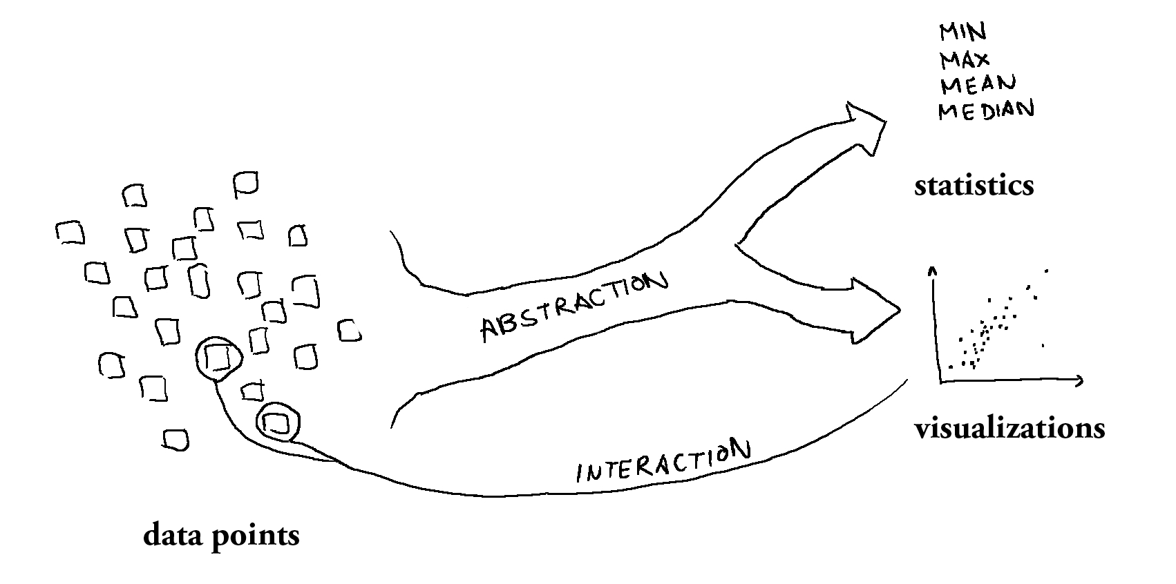
Data sets consist of data points. At some point, these points have been collected and aggregated. This abstraction step leads to broader but less detailed descriptions like statistics. With datavis, we’re no longer trapped on the macro-level — undoing the abstraction and uncovering the original data points in all their glorious micro-level nature.
When we’re looking at gun deaths in the US, for example, we have victims, their ages and place of death. For a proposed health care reform, we have people with specific needs, financial situations and existing insurances. If our topic is well-being across the world, we’re looking at specific regions with various attributes.
Statistics gives us the overarching patterns of the data in an abstract way. A visualization can show these patterns and more: it can even give us back the original data points.
Of course, there are limits to this approach: browsing through every single data point does not scale and would certainly be more confusing than helpful. But every single aspect, every little story we explore by hovering over a dot makes the data more humane and makes it easier for us to tie it back to our own experience of the world.
The superpower of interactive datavis is this fluent switching between the macro-level of overarching patterns and the micro-level of raw anecdotes.
There are also certain types of charts that lend themselves more to a micro-macro approach. The more statistical types of charts like bar or line have a certain aggregation already built-in and make going back to the original data less obvious. Scatter plots are probably the prime example for a micro-macro compatible chart type, with their data-points-become-circles approach.
Enriching anecdotes
The micro-macro idea holds an additional promise: transgressing the restrictions of the visualization itself and providing an even richer picture.
When creating a data visualization, certain aspects of the data just inevitably disappear: some parts might not correspond to the patterns the designer wanted to shed a light on (don’t forget that even datavis designers are authors as Moritz Stefaner argues). Aspects that couldn’t be fit into our meager two visual dimensions were dropped. Or, since data is primarily human-made, the ones that were simply not quantifiable into neat digital numbers were removed.
Nobody can keep designers from making these aspects available through interaction, though!
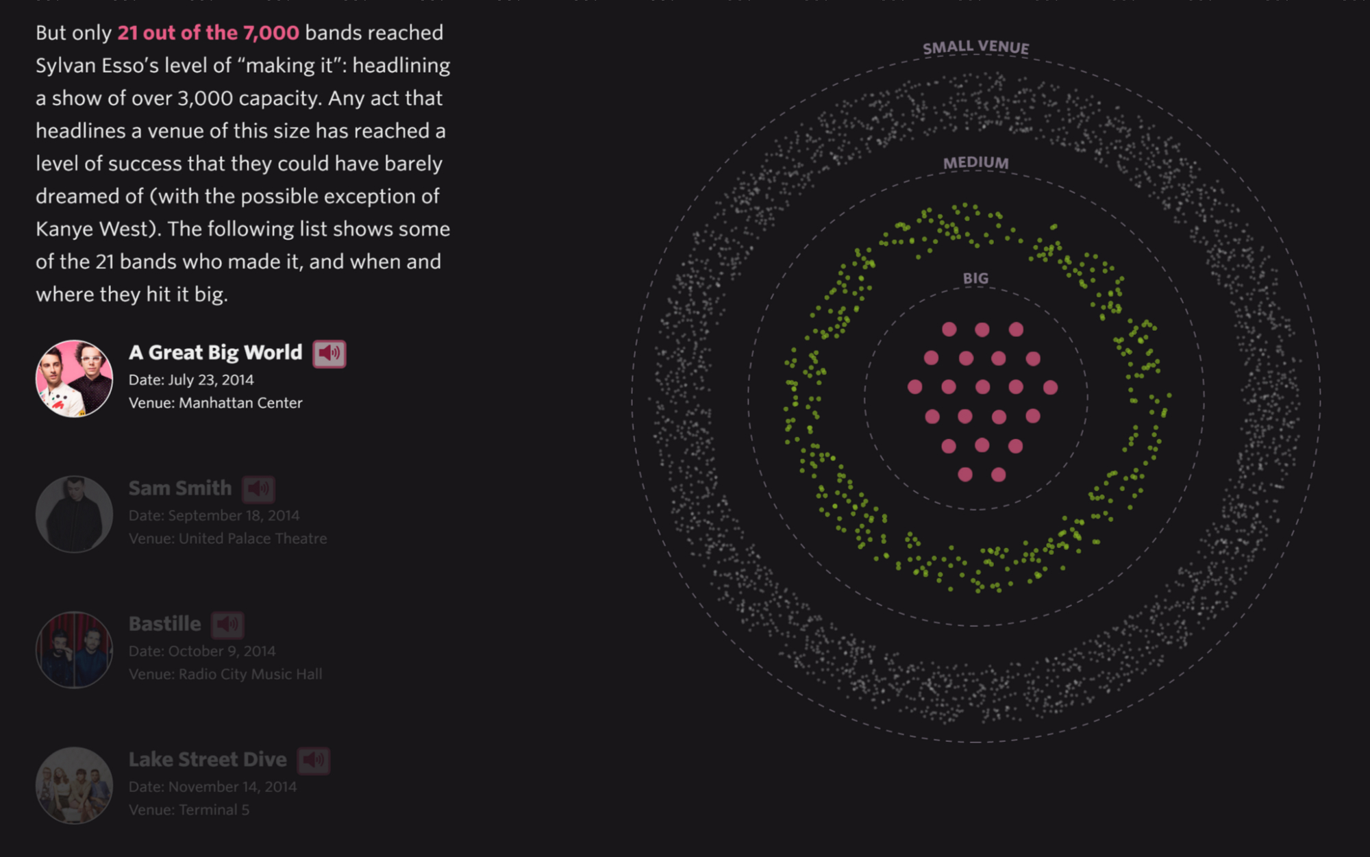
Pudding’s The Unlikely Odds of Making It Big is one such example. The great piece does away with the “Everybody can make it big!” narrative, by example of New York bands.
When reading about successful bands, it’s all too common to hear about their humble origins and coming to the (utterly wrong) conclusion that playing in grimy bars is always just a phase and super-stardom is just around the corner. This again very effectively demonstrates the dangers of emphasizing the micro without mentioning the macro: by reading scores of articles about successful bands without ever being confronted with the reality of the vast majority of musicians, we’re inevitably biased towards overestimating the chances of success.
Making It Big clearly shows the sad reality of only 21 out of the 7000 bands in the data ever playing at bigger venues.
This new context for the anecdotes is very powerful. But the piece also provides additional context lost in the visualization: the actual music. For all the bands in the data that made it big, there are audio samples available to get an idea of what type of music they’re playing. With music being so central to a band’s success (probably), this is a great example for enriching the anecdotes while keeping the context.
The ultimate step in enriching anecdotes and enabling micro-level inspection is showing the actual raw data.
This is something we did in Selfiecity — a project that looks at selfies as a cultural phenomenon through a data lens. One part of it was the Selfiexploratory playground where you can explore the full data set of (currently) 3840 selfies:
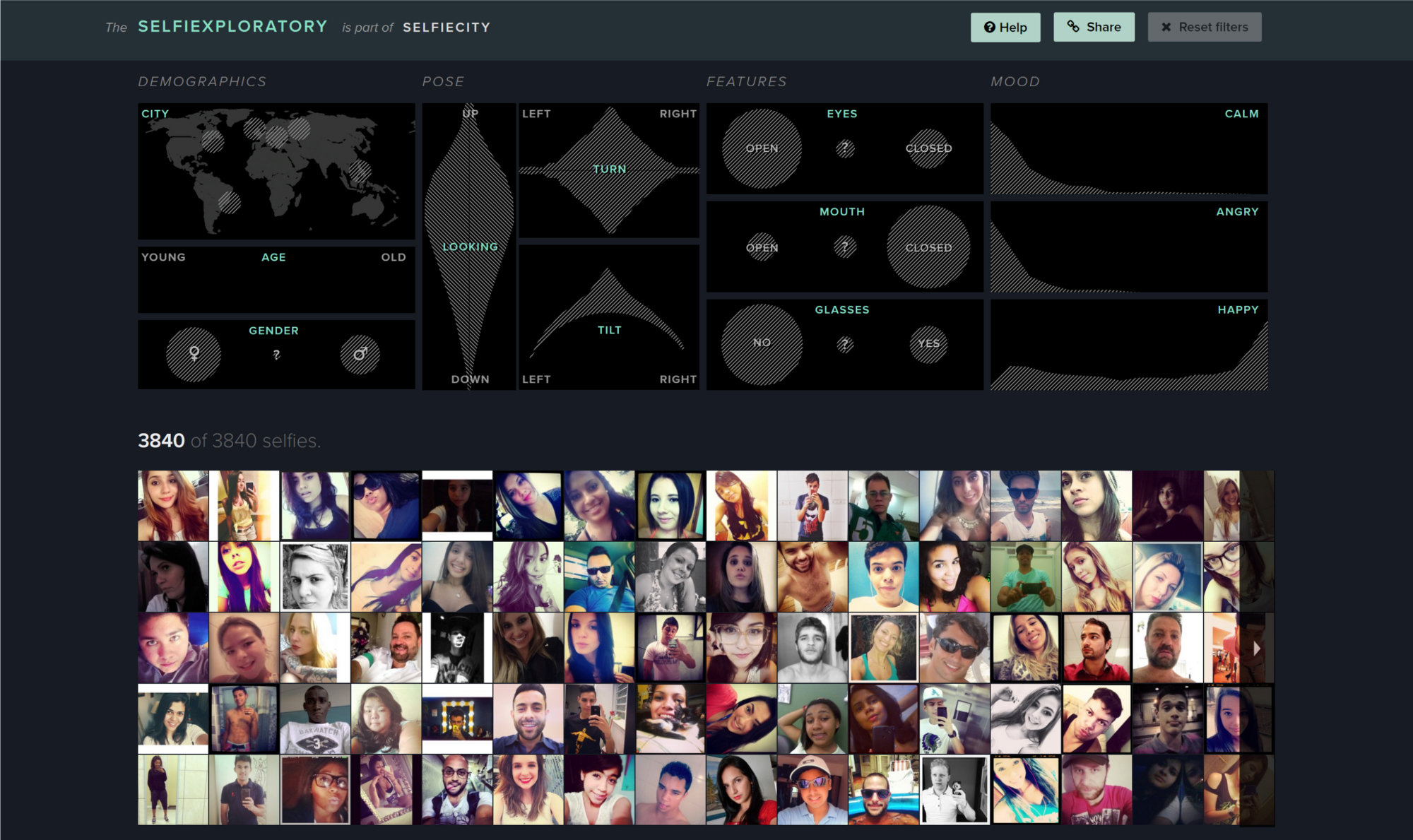
There’s no aggregation or reduction in complexity— except for shrinking the image resolution, the selfies at the bottom of the Selfiexploratory are the same ones we’ve based the overall analysis on. It would be hard to enrich those anecdotes even more.
Providing access to the raw data is much more than a gimmick: as Gregor Aisch argues in his excellent piece on interactive graphics it can create trust through transparency. By making all the data available, the visualization becomes less of a black box and makes fact checking possible.
Since a large part of Selfiecity’s analyses was based on computer vision, we ourselves wanted to be sure that the algorithms that had extracted things like age, gender, pose, facial features and mood from the images had the right idea.
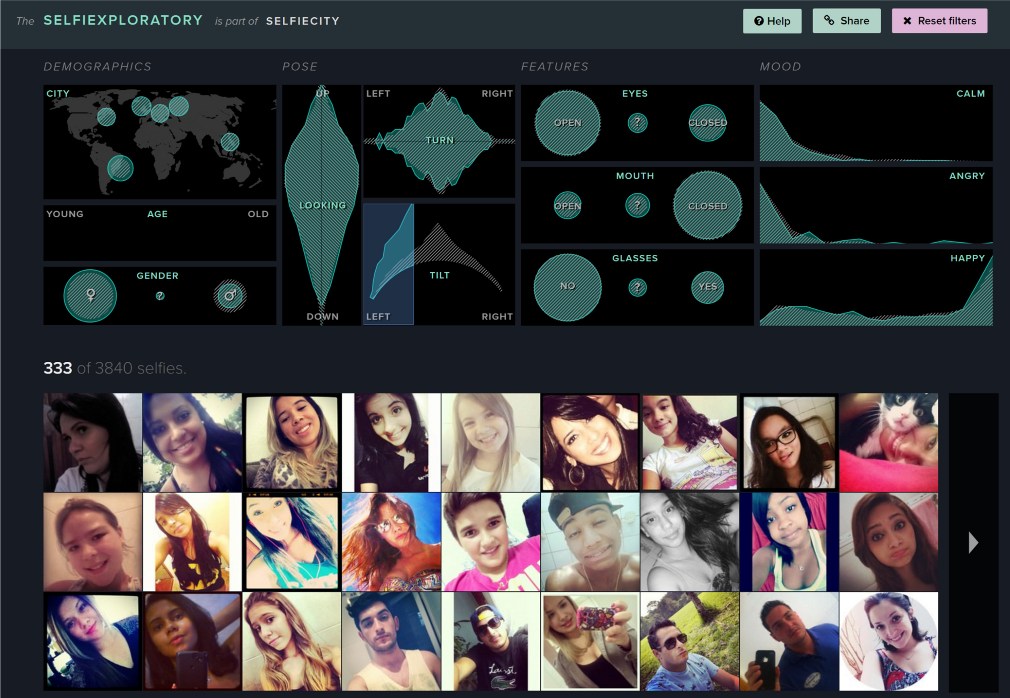
And the Selfiexploratory makes this fact checking a painless process:
Filter for a certain aspect of the data (for example, head tilted to the left) and see if the resulting images make sense (try spotting the feline outlier in the screenshot to the left).
If you spend some time playing with the filters in this way it becomes clear that the computer vision algorithms aren’t perfect — but definitely good enough to reach some overarching conclusions about selfies.
Showing the raw images enables even more. Similar to Pudding’s Making It Big, there’s more to the data than can be expressed in numbers. When you’re thinking about selfies, aspects like head tilt or closed eyes might not be the first associations that pop into your head —a lot of people’s first thought (mine included) is probably duck face.
And despite there not being a reliable duck face algorithm available, having access to the raw data lets you do this analysis yourself on the micro-level: simply by browsing some pages of images with a filter for the usual suspects (young women) you can make up your own mind.
A micro-macro look on the world
When trying to make sense of the world, all of us are overwhelmed by the wealth of data. Taking recourse in fluffy anecdotes heavily distorts our perception, while looking at statistics usually leaves us cold.
Data visualization (as part of data humanism to use giorgia lupi’s great term) can give us the best of both worlds: showing us relatable parts from the data’s micro-level while ensuring we understand how they fit into the overarching macro picture. Going as far as showing the raw data enables fact checking and increases trust.
And by providing aspects that go beyond the limits of computers and visualization we can enrich those anecdotes even further, thus dragging the data down from lofty analytical spheres and making sure it fits in with where it came from: our own world.
Thanks to Moritz Stefaner for suggesting the term ‘micro-macro’ and both him and Alice Thudt for great feedback to the draft.
For more on this topic read these excellent articles by fantastic people:
Giorgia Lupi: Data Humanism, the Revolution will be Visualized.
Gregor Aisch: In Defense of Interactive Graphics.