OECD Better-Life-Index
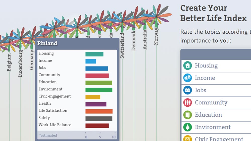
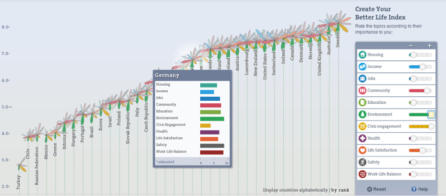
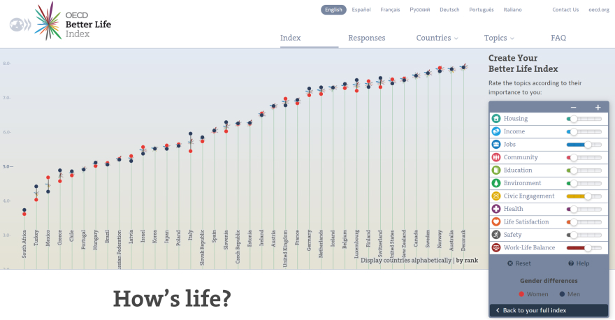
The OECD's Better Life Index project collects year after year well-being data from various countries around the world. Along 11 dimensions such as Housing, Community and Work-Life Balance, the report provides an in-depth look at people's living situations.
The accompanying website hosts one of the older interactive visualizations on the web. Initially built by Moritz Stefaner in Flash, we've transferred the visualization to HTML5 and Javascript in 2013.
The visualization itself shows the various quality-of-life factors for all participating countries from the report. Interactive sorting and filtering lets the reader adjust the viz according to personal preferences to find their own perfect country.
The main challenges in translating from one technology stack to another were replicating the original visuals (especially gradients are quite different from Flash to HTML) and improving the performance (back then, Flash was still a lot faster than Javascript).
Read more about the project in this blog post.
Read more about the underlying performance optimizations here.
Tech
d3.js
velocity.js
pixi.js
i18 (internationalization)